Datashader reductions in spatialdata-plot#
The datashader backend renders large data by binning primitives onto a pixel grid. When several points
fall in the same pixel and you colour by a continuous column, datashader has to combine their
values into one — and datashader_reduction chooses how: take the maximum, the mean, the sum, a count,
and so on. By the end you should be able to:
Understand why a continuous colour needs a reduction on the datashader backend.
Compare
max,mean,sum,count, andstdand read them off the colorbar.Use
method="datashader"for large images.Recognise the datashader contrast caveat.
We use the real Xenium cells dataset from squidpy (its transcripts element and the
morphology_focus image), downloaded and cached on first use.
Watch out: on the datashader backend a
PercentileNormalizedoes not clip to its percentiles — the single most common datashader-contrast surprise, covered in section 5.
Setup#
import squidpy as sq

import spatialdata_plot  # noqa: F401  # registers the .pl accessor

sdata = sq.datasets.cells()
sdata
INFO Loading existing dataset from data/spatialdata/cells.zarr
SpatialData object, with associated Zarr store: /Users/tim.treis/Documents/GitHub/spatialdata-plot/docs/notebooks/examples/data/spatialdata/cells.zarr
├── Images
│     ├── 'he_aligned': DataTree[cyx] (3, 430, 540), (3, 215, 270)
│     ├── 'he_image': DataTree[cyx] (3, 423, 339), (3, 211, 169)
│     └── 'morphology_focus': DataTree[cyx] (4, 430, 540), (4, 215, 270)
├── Labels
│     ├── 'cell_labels': DataTree[yx] (430, 540), (215, 270)
│     ├── 'nucleus_labels': DataTree[yx] (430, 540), (215, 270)
│     └── 'tissue_labels': DataTree[yx] (430, 540), (215, 270)
├── Points
│     └── 'transcripts': DataFrame with shape: (<Delayed>, 13) (3D points)
├── Shapes
│     ├── 'cell_boundaries': GeoDataFrame shape: (94, 1) (2D shapes)
│     └── 'nucleus_boundaries': GeoDataFrame shape: (94, 2) (2D shapes)
└── Tables
      └── 'table': AnnData (94, 5101)
with coordinate systems:
    ▸ 'global', with elements:
        he_aligned (Images), he_image (Images), morphology_focus (Images), cell_labels (Labels), nucleus_labels (Labels), tissue_labels (Labels), transcripts (Points), cell_boundaries (Shapes), nucleus_boundaries (Shapes)
The cells dataset is a small (~3 MB) crop of a real 10x Xenium section (also used in the
Colouring points example). The reductions below aggregate its transcripts points, coloured by the
quality column qv:
list(sdata["transcripts"].columns)
['x',
 'y',
 'z',
 'feature_name',
 'cell_id',
 'fov_name',
 'codeword_index',
 'qv',
 'transcript_id',
 'is_gene',
 'codeword_category',
 'nucleus_distance',
 'overlaps_nucleus']
1. Why a reduction is needed#
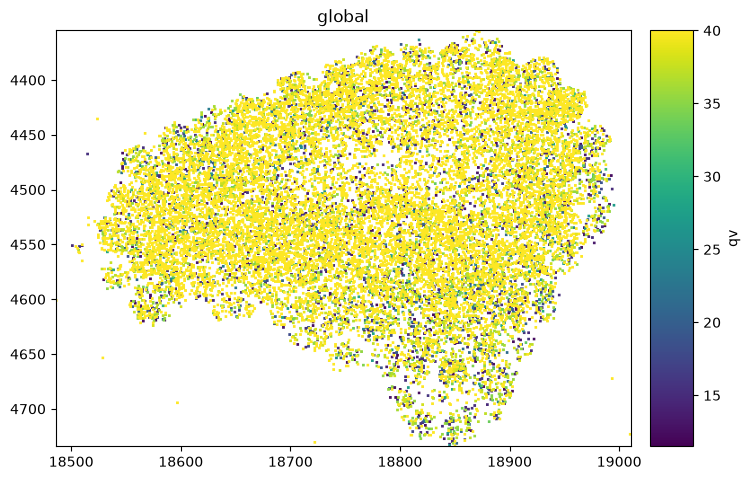
On the datashader backend the transcripts are aggregated into pixels. Colouring by the quality qv,
each pixel may cover many transcripts — datashader_reduction decides which value the pixel shows. The
default is max.
sdata.pl.render_points(
    "transcripts", color="qv", method="datashader", datashader_reduction="max"
).pl.show()
2. max vs mean vs sum#
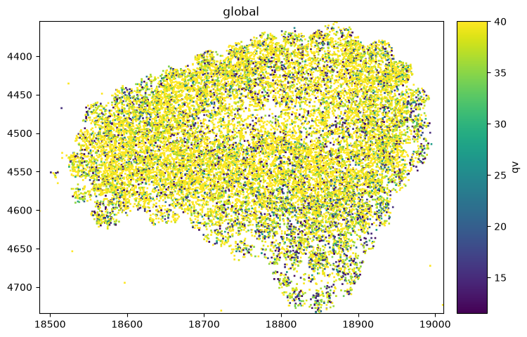
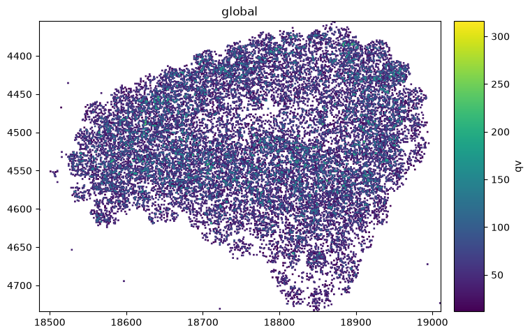
The reduction changes both the picture and the colorbar scale. max reports the single brightest value
in a pixel (bounded by the data max), mean averages, and sum accumulates — so its colorbar runs far
higher wherever transcripts pile up.
As a rule of thumb: sum for abundance, mean for a typical value, max for the brightest signal,
and std (below) for heterogeneity.
for reduction in ["max", "mean", "sum"]:
    sdata.pl.render_points(
        "transcripts", color="qv", method="datashader", datashader_reduction=reduction
    ).pl.show()
3. count and std — structure without a value column#
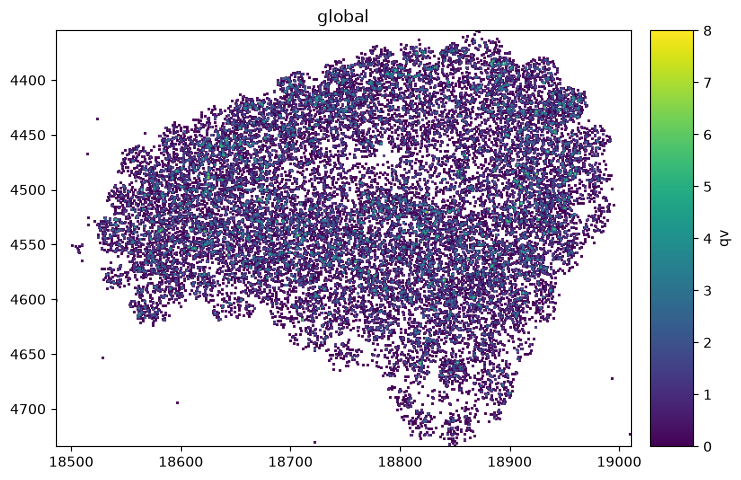
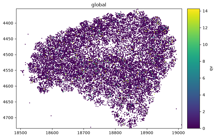
count ignores the colour value and shows how many primitives fall in each pixel (a density — equivalent to
density=True with no density_how, as in the Point density maps notebook). std shows the spread of the values per pixel — useful for finding
heterogeneous regions.
for reduction in ["count", "std"]:
    sdata.pl.render_points(
        "transcripts", color="qv", method="datashader", datashader_reduction=reduction
    ).pl.show()
4. Datashader for large images — method="datashader"#
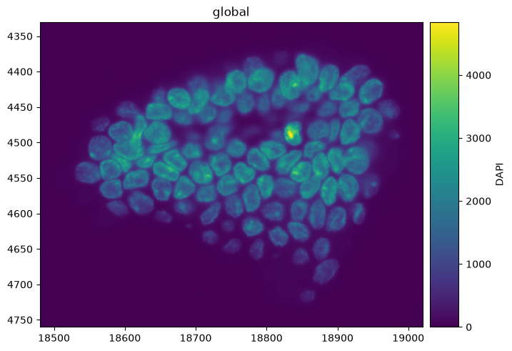
Reductions also apply to images: method="datashader" renders large or sparse rasters by aggregating
pixels, instead of handing the full array to matplotlib.
The image path takes a slightly different reduction vocabulary — it adds mode/first/last and has
no count/any/sum (so sum works on points but not images) — though here we leave datashader_reduction at its default.
sdata.pl.render_images(
    "morphology_focus", channel="DAPI", method="datashader"
).pl.show()
5. The datashader contrast caveat#
On the datashader backend, contrast autoscales to the aggregated value range, not to a norm’s
percentiles — a PercentileNormalize does not clip the way it does on the matplotlib backend (see the
Normalization and contrast tutorial). Explicit vmin/vmax are still honoured. For
percentile-driven contrast, render on the matplotlib backend.
from spatialdata_plot import PercentileNormalize

# On datashader the percentile clip is not applied; contrast follows the aggregate range.
sdata.pl.render_points(
    "transcripts", color="qv", method="datashader",
    datashader_reduction="mean", norm=PercentileNormalize(5, 95),
).pl.show()
Summary#
Contrast caveat first: datashader contrast follows the aggregate range, not norm percentiles — use the matplotlib backend when you need percentile (or any non-
vmin/vmax) contrast.On the datashader backend, a continuous colour needs a reduction to combine the primitives that share a pixel;
datashader_reductionsets it (defaultmax).max/mean/sumchange the picture and the colorbar scale;countgives a density (same asdensity=True) andstdthe per-pixel spread.method="datashader"applies to images too, for large or sparse rasters (with a slightly different reduction vocabulary).
For reproducibility#
# ruff: noqa: F401, F811, I001, E402
# fmt: off
import warnings
import spatialdata_plot

%load_ext watermark
# fmt: on

%watermark -v -m -p spatialdata,spatialdata_plot,squidpy,datashader,matplotlib
Python implementation: CPython
Python version       : 3.14.6
IPython version      : 9.14.1

spatialdata     : 0.7.3
spatialdata_plot: 0.4.1
squidpy         : 1.8.2
datashader      : 0.19.1
matplotlib      : 3.11.0

Compiler    : Clang 20.1.8
OS          : Darwin
Release     : 25.2.0
Machine     : arm64
Processor   : arm
CPU cores   : 8
Architecture: 64bit