Rendering elements as points with as_points#
By default, spatialdata-plot draws each element as its full geometry: a shape
as its polygon or circle, a labels element as its filled segmentation mask.
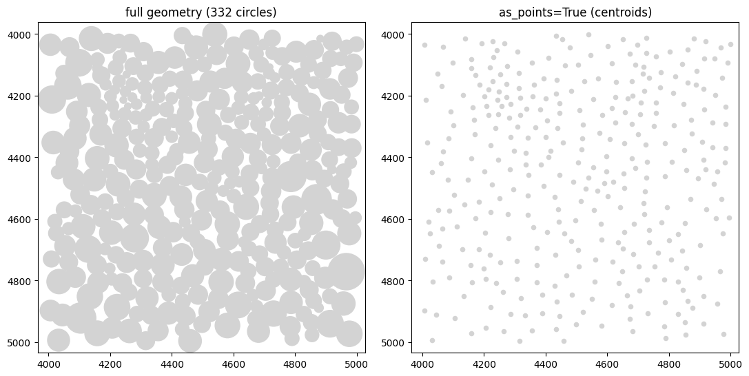
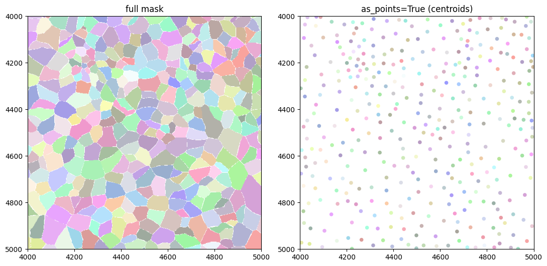
Passing as_points=True to render_shapes() or render_labels() draws one dot
per element at its centroid (its geometric centre) instead. You keep where each object sits and what
colour it has, and you give up its size and outline.
This notebook covers:
what the option looks like on real data, for shapes and for labels,
the appearance controls that still apply (
color,size,cmap,palette),the backend it picks and the 50000-element rule,
what it costs, measured on the full dataset.
The data is a Xenium human breast-cancer section with 167780 cells, so the timings reflect a real workload rather than a toy one.
Setup#
The dataset is the Xenium replicate 1 human breast-cancer sample, converted to
the SpatialData Zarr format and hosted on the scverse example-data bucket. It is
about 3.4 GB. pooch downloads it once and caches it, so later runs are instant.
This notebook is not re-executed in CI, because the download is too large. Its outputs are committed and trusted; run it locally to reproduce them.
import warnings

warnings.filterwarnings("ignore")

import time

import matplotlib.pyplot as plt
import numpy as np
import pooch

import spatialdata as sd
import spatialdata_plot  # noqa: F401  (registers the .pl accessor)
from spatialdata import SpatialData, bounding_box_query, rasterize

XENIUM_URL = (
    "https://s3.embl.de/spatialdata/spatialdata-sandbox/"
    "xenium_rep1_io_spatialdata_0.7.1.zip"
)
unzipped = pooch.retrieve(
    XENIUM_URL,
    known_hash=None,
    fname="xenium_rep1_io_spatialdata_0.7.1.zip",
    processor=pooch.Unzip(),
    progressbar=True,
)
zarr_path = next(p.split(".zarr")[0] + ".zarr" for p in unzipped if ".zarr" in p)
sdata = sd.read_zarr(zarr_path)
sdata
SpatialData object, with associated Zarr store: /Users/tim.treis/Library/Caches/pooch/xenium_rep1_io_spatialdata_0.7.1.zip.unzip/data.zarr
├── Images
│     ├── 'morphology_focus': DataTree[cyx] (1, 25778, 35416), (1, 12889, 17708), (1, 6444, 8854), (1, 3222, 4427), (1, 1611, 2213)
│     └── 'morphology_mip': DataTree[cyx] (1, 25778, 35416), (1, 12889, 17708), (1, 6444, 8854), (1, 3222, 4427), (1, 1611, 2213)
├── Points
│     └── 'transcripts': DataFrame with shape: (<Delayed>, 8) (3D points)
├── Shapes
│     ├── 'cell_boundaries': GeoDataFrame shape: (167780, 1) (2D shapes)
│     ├── 'cell_circles': GeoDataFrame shape: (167780, 2) (2D shapes)
│     └── 'xenium_landmarks': GeoDataFrame shape: (3, 2) (2D shapes)
└── Tables
      └── 'table': AnnData (167780, 313)
with coordinate systems:
    ▸ 'aligned', with elements:
        morphology_focus (Images)
    ▸ 'global', with elements:
        morphology_focus (Images), morphology_mip (Images), transcripts (Points), cell_boundaries (Shapes), cell_circles (Shapes), xenium_landmarks (Shapes)
The object above holds 167780 cells. Xenium ships the cell outlines as shapes
(cell_circles and cell_boundaries) and has no labels element, so there is no
segmentation-mask raster. We build one further down by rasterizing the
boundaries, which lets us show as_points on labels too.
We use a small crop for the pictures, so individual cells stay visible, and the full section for the timings.
1. Shapes: full geometry vs one dot per centroid#
render_shapes(..., as_points=True) replaces each circle or polygon with a
single marker at its centroid. Only the centroid is drawn, so outline_width,
outline_color and shape have no effect.
XMIN, YMIN, XMAX, YMAX = 4000, 4000, 5000, 5000  # a 1000 x 1000 micron window
crop = bounding_box_query(
    sdata,
    min_coordinate=[XMIN, YMIN],
    max_coordinate=[XMAX, YMAX],
    axes=("x", "y"),
    target_coordinate_system="global",
)
n_crop = len(crop["cell_circles"])
print(f"{n_crop} cells in the crop")

fig, axes = plt.subplots(1, 2, figsize=(11, 5.5))
crop.pl.render_shapes("cell_circles").pl.show(
    ax=axes[0], title=f"full geometry ({n_crop} circles)"
)
crop.pl.render_shapes("cell_circles", as_points=True, size=30).pl.show(
    ax=axes[1], title="as_points=True (centroids)"
)
fig.tight_layout()
332 cells in the crop
2. Colour and size still apply#
as_points changes what is drawn at each location, not how colour is resolved.
color accepts a gene name (looked up in the annotating table), a column on the
element or its table, or a literal colour. Continuous values use cmap and
categorical values use palette, exactly as for the full geometry, and legends
and colourbars behave the same way.
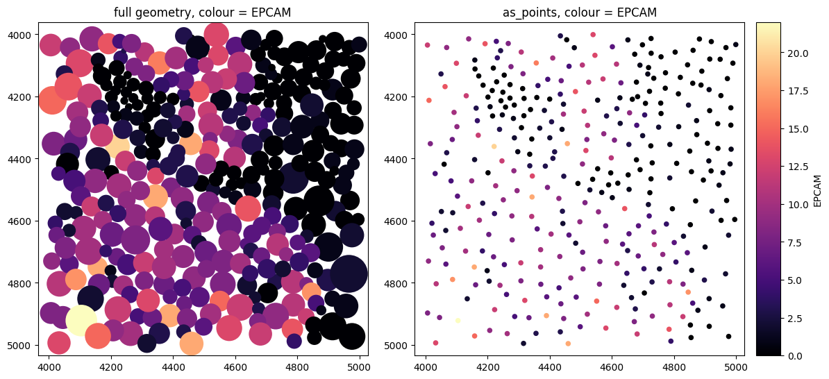
Here we colour by EPCAM, an epithelial marker. Its expression follows the
tissue: the ductal and tumour regions are bright, the surrounding stroma is dark.
The centroid view keeps that spatial trend after dropping the outlines.
The two panels below share a single colourbar only because they plot the same
EPCAM values. To guarantee a shared scale across panels that differ, pass an
explicit norm (e.g. matplotlib.colors.Normalize(vmin, vmax)) to each render call.
fig, axes = plt.subplots(1, 2, figsize=(11, 5.5))
# Both panels share the same EPCAM scale, so we draw a single colourbar (right).
crop.pl.render_shapes("cell_circles", color="EPCAM", cmap="magma", colorbar=False).pl.show(
    ax=axes[0], title="full geometry, colour = EPCAM"
)
crop.pl.render_shapes(
    "cell_circles", color="EPCAM", cmap="magma", as_points=True, size=30
).pl.show(ax=axes[1], title="as_points, colour = EPCAM")
fig.tight_layout()
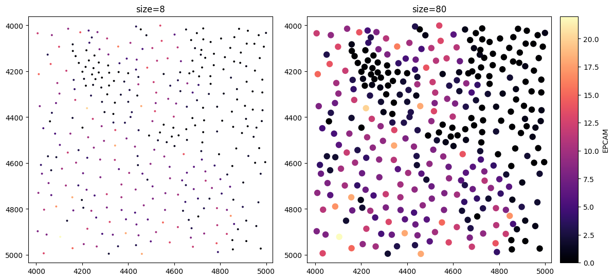
size sets the marker area (matplotlib’s scatter s), independent of the data.
It is a styling choice, not the cell’s real size, which the centroid view does
not carry. Larger markers read better when zoomed out; smaller ones keep dense
regions from overlapping into a blob.
The default is size=1.0, deliberately tiny so that dense point sets do not merge
into a blob; you will usually raise it, as every example here does.
fig, axes = plt.subplots(1, 2, figsize=(11, 5.5))
crop.pl.render_shapes(
    "cell_circles", color="EPCAM", cmap="magma", as_points=True, size=8, colorbar=False
).pl.show(ax=axes[0], title="size=8")
crop.pl.render_shapes(
    "cell_circles", color="EPCAM", cmap="magma", as_points=True, size=80
).pl.show(ax=axes[1], title="size=80")
fig.tight_layout()
3. Labels: segmentation masks as centroids#
Xenium has no labels element, so we build one from the real cell boundaries.
rasterize(..., return_regions_as_labels=True) paints each cell’s polygon with
its integer id, producing a segmentation mask whose pixel value is the cell id.
render_labels(..., as_points=True) then draws one dot per label. The centroids
come from the rendered, display-resolution raster, so the computation stays
cheap. contour_px and the outline options are ignored.
cell_masks = rasterize(
    crop["cell_boundaries"],
    ["x", "y"],
    min_coordinate=[XMIN, YMIN],
    max_coordinate=[XMAX, YMAX],
    target_coordinate_system="global",
    target_unit_to_pixels=1.0,
    return_regions_as_labels=True,
)
crop["cell_masks"] = cell_masks

fig, axes = plt.subplots(1, 2, figsize=(11, 5.5))
crop.pl.render_labels("cell_masks").pl.show(ax=axes[0], title="full mask")
crop.pl.render_labels("cell_masks", as_points=True, size=30).pl.show(
    ax=axes[1], title="as_points=True (centroids)"
)
fig.tight_layout()
4. The speed trade-off#
as_points exists mainly for speed. We subsample the real cells across a range
of counts, up to the full 167780, and time each render. The backend is held at
matplotlib, so the comparison is drawing N polygons or masks against drawing N
dots.
def time_best(fn, repeat=3):
    # Best wall-clock of `repeat` runs, closing figures between them.
    best = np.inf
    for _ in range(repeat):
        t0 = time.perf_counter()
        fn()
        plt.close("all")
        best = min(best, time.perf_counter() - t0)
    return best
# Shapes: draw N circles against N centroid dots, up to every cell in the section.
circ = sdata["cell_circles"]
shape_ns = [1_000, 5_000, 20_000, 50_000, 100_000, len(circ)]
shape_full, shape_pts = [], []
for n in shape_ns:
    s = SpatialData(shapes={"c": circ.iloc[:n].copy()})
    shape_full.append(time_best(lambda: s.pl.render_shapes("c", method="matplotlib").pl.show()))  # noqa: B023
    shape_pts.append(
        time_best(lambda: s.pl.render_shapes("c", as_points=True, method="matplotlib").pl.show())  # noqa: B023
    )
    print(f"N={n:>7}:  full {shape_full[-1]:6.2f}s   as_points {shape_pts[-1]:5.2f}s   "
          f"({shape_full[-1] / shape_pts[-1]:.0f}x)")
N=   1000:  full   0.03s   as_points  0.01s   (4x)
N=   5000:  full   0.14s   as_points  0.02s   (9x)
N=  20000:  full   0.51s   as_points  0.04s   (13x)
N=  50000:  full   1.29s   as_points  0.09s   (14x)
N= 100000:  full   2.53s   as_points  0.16s   (15x)
N= 167780:  full   4.31s   as_points  0.27s   (16x)
# Labels: draw the filled mask against N centroid dots. We rasterize progressively
# larger crops to grow the cell count.
label_sides = [1_000, 4_000, 8_000, 12_000]
x0, y0 = 2_000, 2_000
label_ns, label_full, label_pts = [], [], []
for side in label_sides:
    cb = bounding_box_query(
        sdata["cell_boundaries"],
        min_coordinate=[x0, y0],
        max_coordinate=[x0 + side, y0 + side],
        axes=("x", "y"),
        target_coordinate_system="global",
    )
    m = rasterize(
        cb, ["x", "y"],
        min_coordinate=[x0, y0], max_coordinate=[x0 + side, y0 + side],
        target_coordinate_system="global", target_unit_to_pixels=1.0,
        return_regions_as_labels=True,
    )
    s = SpatialData(labels={"m": m})
    label_ns.append(len(cb))
    label_full.append(time_best(lambda: s.pl.render_labels("m").pl.show()))  # noqa: B023
    label_pts.append(
        time_best(lambda: s.pl.render_labels("m", as_points=True, method="matplotlib").pl.show())  # noqa: B023
    )
    print(f"N={len(cb):>6}:  full mask {label_full[-1]:5.2f}s   as_points {label_pts[-1]:5.2f}s")
N=   424:  full mask  0.10s   as_points  0.09s
N=  5833:  full mask  0.11s   as_points  0.10s
N= 18606:  full mask  0.12s   as_points  0.12s
N= 39125:  full mask  0.17s   as_points  0.15s
fig, (axL, axR) = plt.subplots(1, 2, figsize=(12, 4.5))

axL.plot(shape_ns, shape_full, "o-", label="full geometry")
axL.plot(shape_ns, shape_pts, "o-", label="as_points")
axL.set(title="Shapes", xlabel="cells", ylabel="render time (s)")
axL.set_xscale("log")
axL.legend()

axR.plot(label_ns, label_full, "o-", label="full mask")
axR.plot(label_ns, label_pts, "o-", label="as_points")
axR.set(title="Labels", xlabel="cells", ylabel="render time (s)")
axR.set_xscale("log")
axR.legend()

fig.tight_layout()
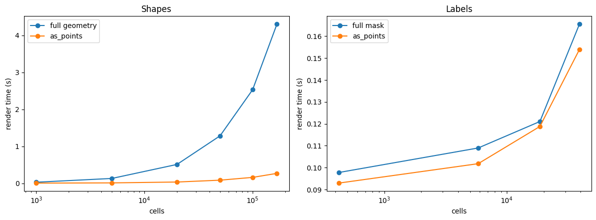
The two panels behave differently:
Shapes: a large gain that grows with cell count. Each circle is a vector primitive matplotlib draws one at a time, while a centroid is a single scatter point. At the full section (167780 cells)
as_pointsis roughly 15 times faster.Labels: about the same either way. A labels element renders as a raster (an
imshowdownsampled to the display), whose cost tracks display pixels rather than cell count, and computing centroids costs about as much. For labels,as_pointsgives a different look, not a speedup.
Use as_points on shapes when you have many objects and do not need their
morphology. Use it on labels when you want the centroid representation.
5. Backend and the 50000 rule#
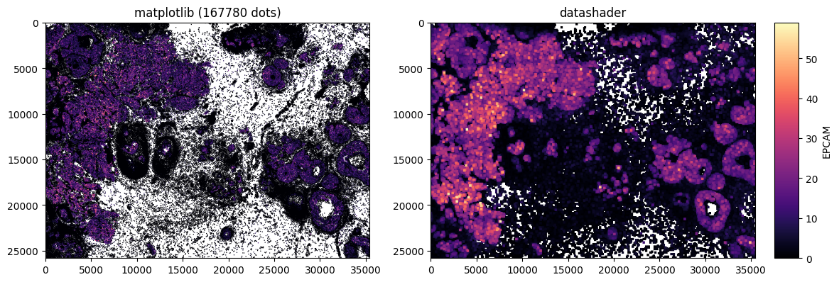
datashader is a library that renders very large point sets by aggregating them
into a pixel grid instead of drawing each dot individually; spatialdata-plot uses
it as an optional backend. The dots can be drawn by either backend, set with method:
method="matplotlib": per-glyph scatter, exact, good up to tens of thousands of dots.method="datashader": density raster, scales to millions.method=None(default): matplotlib, switching to datashader above 50000 centroids (AS_POINTS_DS_AUTO = 50000), because matplotlib’s per-glyph cost starts to dominate around there.
datashader aggregates and then shades, so it cannot represent one distinct random colour per cell, which is the default colouring of a labels element with no colour column. In that case it falls back to matplotlib with a warning. With a real colour column, as below, both backends work and differ only in appearance.
As in section 2, the single colourbar below is valid only because both panels map the
same values; pass an explicit norm to guarantee a shared scale otherwise.
fig, axes = plt.subplots(1, 2, figsize=(11, 5.5))
# Shared EPCAM scale, so the colourbar is drawn once on the right panel.
sdata.pl.render_shapes(
    "cell_circles", color="EPCAM", cmap="magma", as_points=True, method="matplotlib", colorbar=False
).pl.show(ax=axes[0], title="matplotlib (167780 dots)")
sdata.pl.render_shapes(
    "cell_circles", color="EPCAM", cmap="magma", as_points=True, method="datashader"
).pl.show(ax=axes[1], title="datashader")
fig.tight_layout()
When to reach for as_points#
Many shapes, morphology not needed: a fast overview of hundreds of thousands of cells coloured by a value, without waiting on polygon drawing.
Positions over an image: dots read more clearly than filled masks on top of tissue.
Not for label speed: rendering a mask is already fast, so use
as_pointson labels only for the dot look.Remember what is dropped: the cell’s real size, outline and shape. The marker
sizeis a styling value, not the cell’s area. When those properties carry meaning, keep the full geometry.
For reproducibility#
# ruff: noqa: F401, F811, I001, E402
# fmt: off
import spatialdata_plot

%load_ext watermark
# fmt: on
%watermark -v -m -p spatialdata,spatialdata_plot,matplotlib,numpy,datashader,pooch
Python implementation: CPython
Python version       : 3.14.4
IPython version      : 9.13.0

spatialdata     : 0.7.3
spatialdata_plot: 0.4.1
matplotlib      : 3.10.9
numpy           : 2.4.4
datashader      : 0.19.0
pooch           : 1.9.0

Compiler    : Clang 20.1.8
OS          : Darwin
Release     : 25.2.0
Machine     : arm64
Processor   : arm
CPU cores   : 8
Architecture: 64bit